futzle

PEDANTRY

ON THE EIGHTH DAY OF CRANKVENT... CHRISTMAS CHAUVINISM

Merry Chauvinismas!

Northern Hemisphere people, for all the land mass they occupy, can be very insular. For them, it's self-evident that birds fly south for the winter, that the shadow on the sundial advances clockwise—by definition—and that the first-quarter moon appears over the southern horizon like this:

Image from moonzoo.org.

Image from moonzoo.org.

They are at their most insufferable about what seasons months should be in. Christmas, in particular, simply has to be in winter. 'Joseph and Mary were looking for shelter from the cold,' they remind us, though it would require an Act of God to make it snow in Bethlehem.  'It's a winter solstice festival,' they opine, as if Holy Roman Emperor Constantine didn't just pull December 25 out of his newly-Christian behind. 'In the French Republican Calendar, Christmas is 4 Nivôse,' they piously point out, hoping that we'll notice the month is named for the French word for snow.

This chauvinism—there, another French word—extends to so many aspects of Christmas as it is traditionally celebrated that they cannot imagine it any other way. Snowpersons, penguins (think about where penguins live) and yule logs symbolize the cold, while stars, blinkenlights and yule logs symbolize the long nights. These symbols permeate the culture of their Christmas in its carols and decorations.

But that's their Christmas, not mine. I'm a born and bred Southerner, so Christmastime for me is hot, long summer days, grevillea robusta and jacaranda in bloom, cricket, ice cream and camping holidays. This is perfectly natural to me, though I'll allow that it's a bit silly putting up Christmas lights when the sun doesn't set until half an hour before bedtime.

I did Christmas in the Northern Hemisphere once. It was educational, and a bit of a letdown: it wasn't new to me, because I'd lived it vicariously through lifelong exposure to it on TV and in music. By four in the afternoon it was dark and I found myself wanting ice cream.

I almost feel sorry for Northerners, with their Christmas monoculture, but it didn't have to be that way. If it weren't for Pope Gregory abolishing the Julian calendar in 1582, then in a mere 22,000 years December 25 would have occurred on the (northern) summer solstice. Imagine how silly the French Republicans would look then!

DEBORAH PICKETT (@FUTZLE) HAS MOSS ON THE SOUTH SIDE
REPROACH

SO SAD THEY HAD TO FADE IT

Back in a previous life, I fancied myself as something of a musician. I was self-taught, so I would play on the family piano what I heard on the radio. When my listening skills weren’t up to the job I would spend hours in the basement of Allans on Collins Street, leafing through the sheet music and memorizing chord progressions—something I was genuinely good at—to practise when I got back home. The sheet music was way too expensive to actually buy.

So many songs on the radio would end the same way: Repeat And Fade. This would be what the sheet music said: 𝄆 eight bars 𝄇, then, as if it was helpful to me on my Becker upright grand, Repeat And Fade. In case younger readers don’t know, no, analogue pianos don’t have a volume control. The best I could manage was to play ever softer, poco a poco piano, until I was barely touching the keys.

When I was older, I started taking music theory lessons. One part of the syllabus was “cadences”, with peculiar names for the different chord progressions that end a piece of music: perfect, imperfect, pluperfect, plagal, interrupted. Cadences seemed to me at the time pointless. Who uses them? Surely everyone just ends with Repeat And Fade!

Apparently not, I was to learn as I broadened my musical tastes. Classical music hardly ever ends with Repeat And Fade. [1] Classical music is full of proper, perfect (or imperfect, or past perfect) cadences. And it hardly affected sales of their albums at all! When Mozart was writing his Requiem, he didn’t just toss together 'Kyrie eleison' (Repeat And Fade). He stuck a proper plagal cadence onto it, sung to the now-famous lyric: 'Amen!'

So how did we lose the art of The Ending? When did composers decide, ‘screw it, it’s too hard to end this song properly, I’ll just turn the volume down’? Or was it the sound engineers, concerned about job security, putting their inimitable touch onto the recording process? Or was it the performers, too absorbed in their jam sessions, to remember how many bars they’d played? Is all modern music written by Stephen King? I don’t know, but I think it’s a cop-out and it has to stop. All songs should end properly. Heck, even 99 Bottles of Beer on the wall has an end. [2]

My plea goes out to all musicians everywhere: Shun Repeat And Fade! Spend five minutes wrapping up your songs properly. Use a cadence if you need; there are plenty to choose from. Kids with their analogue pianos will thank you from the bottom of their too-cheap-to-buy-the-sheet-music hearts.

Plagal cadence to that!

DEBORAH PICKETT (@FUTZLE), MELBOURNE 

  1. One well-known exception was the last 15 seconds of John Cage’s 4’33”.
  2. Imagine if it didn’t: zero bottles of beer on the wall / take one down, pass it around / minus one bottles of beer on the wall.
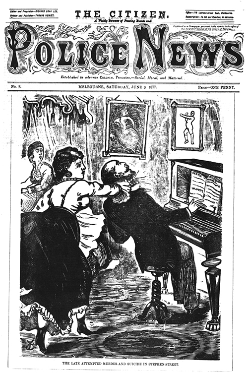
Early adopters of the "Repeat and Fade" technique were met with harsh criticism. Wood engraving, State Library of Victoria, accession no. PN09/06/77/00. Available at http://handle.slv.vic.gov.au/10381/259013.

Early adopters of the "Repeat and Fade" technique were met with harsh criticism. Wood engraving, State Library of Victoria, accession no. PN09/06/77/00. Available at http://handle.slv.vic.gov.au/10381/259013.

WHINGE

MY KINGDOM FOR A REMOTE

In the 1990s TV series Beverly Hills, 90210, whenever Tori Spelling’s character appears on the screen, the world goes Thin. Everything on screen, including her, is stretched vertically. It’s easiest to notice this in scenes that include a second character. First, there is Normal Jason Priestley by himself, then a cut to Freakishly Thin Jason Priestley standing next to Tori Spelling, then another cut to Normal Jason Priestley by himself again. Presumably this arrangement between Tori Spelling and the producers of 90210, whoever they were, was intended to flatter her with the appearance—frankly unnecessary—of even more skinniness. Instead, it’s uncanny.

Even a square—a literal square, not a figurative one like me—next to 90210’s Tori Spelling, wouldn’t be square. It would be taller than it is wide. The ratio of that no-longer-square’s width to its height is called its “aspect ratio”. Proper, Jason-Priestley-type squares, have an aspect ratio of one to one, or “1:1” in the language of the industry. A Next-To-Tori-Spelling-Square would have an aspect ratio of about 0.8:1 (equivalently 4:5, because only the ratio matters).

Your TV also has an aspect ratio. Its image is wider than it is tall, so it has an aspect ratio greater than 1. If you are a grumpy old fart, you will remember the TV that you used to have had an aspect ratio of 1.33:1 (or 4:3). You will no doubt also remember the elation and freedom you felt with your first “widescreen” TV, with an aspect ratio of 1.85:1 (or 16:9). At least until you discovered that there was not in fact any widescreen content available for your expensive new TV. All the analogue channels steadfastly presented their content in 4:3 until the day they died. But dammit, you paid for that extra screen real estate, and dammit, you were going to use it. So you stretched the too-narrow picture horizontally so that it filled the whole screen. Or, perhaps, that was the TV’s default setting and you couldn’t find the button on the remote control to adjust the picture. The result? Everything is fat. The people are fat; the squares are fat; even the test pattern is fat.

TVs in hotels are the worst offenders. They are fed by 1980s-era analogue signal distribution boxes, happily churning out 4:3 pay-per-view movies to brand-new widescreen LCD televisions. On the assumption that you are a thieving remote-control hoarder, the hotel gives you a special hotel-only remote control with, invariably, no button to fix the aspect ratio. You are forced to watch your movie full of fat people. But dammit, you paid for that movie, and dammit, you’ll watch it.

This is why, when I stay at a hotel, a little part of me hopes that they are screening old episodes of Beverly Hills, 90210. The Fat of the hotel TV would be cancelled by the Thin of 90210. It’s probably the only way I’ll get to see Normal Tori Spelling. (And Freakishly Fat Jason Priestley, but let’s not think about that.)

DEBORAH PICKETT (@FUTZLE) is presented in 1:1.

Alas this promising potentiality was abandoned after several serious misdiagnoses and many other transgressions, not all of which were entirely due to viewing patients at the incorrect aspect ratio. Reproduction of a drawing after D.L. Ghilchip, 193…

Alas this promising potentiality was abandoned after several serious misdiagnoses and many other transgressions, not all of which were entirely due to viewing patients at the incorrect aspect ratio. Reproduction of a drawing after D.L. Ghilchip, 1932. Plate to: Punch, 21 September 1932, p. 321. Wellcome Library, No. 15504i. 

PEDANTRY

DASHED HOPES

We have been living in a typographic wasteland, and computers are to blame. Through sheer dumb luck of having been chosen for the original 95 characters that make up ASCII, some characters grace almost every keyboard, giving them an undeserved familiarity. Meanwhile, other characters, much more valuable from a typographic perspective, are relegated to obscurity.

You are probably cozy with the characters @, \ and ^. Try to imagine email addresses, or ASCII art, without them. They are so ingrained that it may not occur to you how rare they were before the age of computers. The architects of ASCII allocated slots for these glyphs but opted to give just one slot to the character “-”. This ambiguous little horizontal line has had to take on three part-time jobs. It does none of them well. It is a hyphen, which joins words tighter than a space. This is the symbol that distinguishes 50-odd CRANK readers from 50 odd CRANK readers. It is a dash, which separates words looser than a space. This is the symbol that lets you shift to something parenthetical—or to specify a range—and then come back afterwards. It is a minus sign, which makes numbers negative. This is the symbol that lets you talk about imaginary things like √−1.

The trouble with ASCII “-” is that it can’t fulfil all of these different typographical roles. If it’s short enough to be a hyphen, it’s too small to be a dash or a minus sign. If it’s low enough to the baseline to be a dash or a hyphen, it sits too low next to numerals when used as a minus sign.

(Once I had a Dan Brown ebook that used the same “-” character for hyphens and dashes. Reading it was horrible. When I encountered one of these hyphen-cum-dashes—and Dan Brown uses them a lot—I didn’t know whether to speed up or slow down. I dreaded them when my peripheral vision spotted them coming up on the screen.)

No longer does this poor character have to suffer, and nor do your readers. You live in a post-ASCII world, where you can write not only English, but also français and ελληνικά. It’s easy to write proper hyphens, proper dashes, proper minus signs. It’s easy to say that the forecast temperature range is −5°–−1°. It’s easy to talk about ASCII-art cows on Healesville–Koo-Wee-Rup Road. It may even—this might be less-than-easy—improve that Dan Brown ebook.

DEBORAH PICKETT (@FUTZLE), MELBOURNE

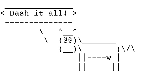
ASCII art courtesy of the standard Unix program “cowsay” by Tony Monroe (tony@nog.net).

ASCII art courtesy of the standard Unix program “cowsay” by Tony Monroe (tony@nog.net).

50-odd CRANK readers, or 50 odd CRANK readers? Also known as Doctor Botherum, an itinerant medicine vendor selling his wares on stage with the aid of assistants to a raucous crowd. Coloured etching by Thomas Rowlandson, 1800. From the Wellcome Libra…

50-odd CRANK readers, or 50 odd CRANK readers? Also known as Doctor Botherum, an itinerant medicine vendor selling his wares on stage with the aid of assistants to a raucous crowd. Coloured etching by Thomas Rowlandson, 1800. From the Wellcome Library, no. 20582i.